Figma vs Adobe XD | Which UX Design Tool is Better in 2022
Sketching has been the most popular design tool for users for creating user interface (UI) and user experience (UX). However, digital sketching saw massive advancements with popular designing tools; Figma and Adobe XD. Both of them are excellent pieces of software, but each has its own strengths and weaknesses. In this blog, we are going to have an in-depth comparison between Figma and AdobeXD. We will also learn the benefits of using design tools for web or mobile app development.
Before we get started with the comparison, we should learn about UX Design Tools
What is a UX Design Tool?
A UX design tool is an online software or web application that allows UX designers to create and design digital products such as web or mobile applications. Furthermore, these design tools are also known as wireframe tools that are used in creating MVP (Minimum Viable Product) to test the basic version of a mobile application.
A top mobile app development company uses premium design tools to create user-friendly architecture and product design that gives an engaging mobile experience.
Some of the Best Examples of Design Tools:
- Sketch
- Adobe XD
- Marvel
- Figma
- InVision Studio
Figma vs Adobe XD: Which UX Design Tool is Better in 2022?

Quick Overview
a. Figma
Figma is a cloud-based application that has easy-to-use and intuitive features for creating user interfaces, wireframes, and prototypes of web or mobile applications. It has a FIGJAM dashboard that has features for brainstorming design ideas, online presentations, and diagrams.
This tool allows designers to seamlessly make flexible designs with different capabilities like Autolayout, easy-to-use constraints, Smart Animate, and set competent combinations. However, since Figma is a cloud-based app, it doesn’t allow the file to be opened in an offline state.
b. Adobe XD
Adobe XD is a well-known UI prototyping and prototyping tool that has gained huge popularity among Adobe-native designers and the mobile app developer community. Furthermore, it provides several features similar to Figma. In fact, it allows designers and development teams to integrate useful communication tools such as Slack and Mircosoft teams. XD is a robust tool but it gets slowed down during large or complex projects.
1. Cost Efficiency
a. Figma
Figma is a free design tool but also offers subscription-based plans for designers and developers. Plus, they offer a 30-day version history and a large range of cloud storage. Figma’s individual plan will cost you around $12-$15. For enterprise or business organizations who need complex-level or high-scale functionality for designing, they can start using Figma from the $45 per editor plan. Thus, there are a lot of options for every individual.
b. Adobe XD
Adobe XD is also a free design tool. Its pricing ranges from free to $79.99/month. XD offers different sets of pricing plans for individuals, businesses, and enterprises. If you are an individual designer, it has the most affordable plan that starts at $9.99/month.
Winner of this Comparison Parameter: Figma
At present, Figma gives unlimited features as compared to XD in terms of free pricing plans. So it is clear that in terms of the cost of using the design tool. Figma beats XD.
2. Supported Platforms
a. Figma
As Figma is a browser-based web application it allows editing in any browser which supports WebGL. In fact, it enables designers to view their created designs in desktop browsers. Figma has a special feature called Figma Mirror App by which mobile app developers or designers can easily preview their UI layout on different sizes of mobile screens to check how the design look and feels on the actual device. Ultimately, Figma can run on all OS platforms including Windows, Mac OS X, and Linux.
b. Adobe XD
XD is a dynamic platform that can be used on a desktop, mobile drive, or browser. It is suitable for macOS and Windows OS systems. AdobeXD is also available in the XD mobile app version that allows you to preview files and design for Android and iOS devices. However, at present, XD doesn’t facilitate viewing design on mobile browsers and other desktop browsers.
Winner of this Comparison Parameter: Figma
Because it can run on multiple OS platforms including Linux.
3. Position of Toolbars
a. Figma
Figma has a horizontally aligned toolbar section. In fact, it appears at the top of its work dashboard which gives an ease of viewing and finding the helpful asset on the top side of the screen.
b. Adobe XD
XD has a vertically aligned toolbar which makes it a little bit more time-consuming in finding and viewing the asset during the design process.
Winner of this Comparison Parameter: Figma
Figma’s horizontal toolbar is better than the vertical toolbar position because it is much easier and faster for selecting the assets.
4. Live Collaboration
a. Figma
Figma allows multiple end-users to log in and work on the same document at the same time. In fact, you can see an avatar for each user on the screen on the right of the toolbar. Furthermore. Figma offers additional features for live collaboration such as team libraries, automatics saving and syncing.
b. Adobe XD
It also offers a co-editing feature that allows real-time or live collaboration in the cloud. XD offers a simple sharing facility across its Creative Cloud Libraries as same as the live-editing features of Figma.
Winner of this Comparison Parameter: Figma
Because Figma is a web application that makes it compatible with live collaboration. Moreover, it has more features for real-time collaboration compared to Adobe.
5. Document Sharing Capability
a. Figma
Figma enables its end-users to share documents with a simple link. With this link, other users can view or edit the document in the system. Thus, it allows sharing the document between multiple designers as same as what developers do on Github or CodePen platforms.
b. Adobe XD
AdobeXD allows end-users to send emails to others to let them view or edit the file via links. It also allows end-users to make a link and optimize it for various purposes such as
- Development
- User Testing
- Design Review
- Customization
Winner of this Comparison Parameter: Figma
Adobe XD has also nice support for document sharing but it still falls behind Figma in terms of additional team management features.
6. Interactions
a. Figma
Figma offers a wide range of options for interactions for end users. However, it only offers only one interaction per UI element.
b. Adobe XD
XD allows users to define two interactions per user interface element. It has more features for interactions for multiple activities.
Winner of this Comparison Parameter: Adobe XD
Adobe XD has more features for interactions
7. Animation
a. Figma
Figma has a ‘Smart Animate’ function that allows you to connect frames and animate the differences in the properties. In fact, it assists UX designers in identifying the difference and animating the layers between frames in a prototype. With Smart Animate, you can make touch gestures, expand content, parallax scrolling, loading sequences, toggles, sliders, and other modern UX animations.
b. Adobe XD
Adobe has an ’Auto-Animate’ feature that enables you to connect artboards and animate the differences in their properties. It has AI capability that empowers you to make high-standard or complex animations quickly and easily. With Adobe XD Auto-Animate, you can integrate component states and insert attractive hover, scroll, swipe, toggle, and other animated interactions.
Winner of this Comparison Parameter: Adobe XD
Since Adobe has an AI-based animation feature, it gives more capability to make advanced and interactive animation in UX design.
8. Resizing Elements
a. Figma
It has an ‘Auto Layout’ feature that lets you make buttons that could be expanded or compressed when the user edits text. In fact, you can implement an automatic layout to the existing components and rapidly create lists that adapt to adding new items.
b. Adobe XD
Adobe XD has a ‘Responsive Resize’ feature by which you can resize assets and objects during retaining their position and scale. However, this is a bit time-consuming.
Winner of this Comparison Parameter: Figma
Figma gives more flexibility in resizing the elements which saves your time and effort in experimenting with different combinations. So in this parameter, Figma takes the point.
Let’s Conclude this Comparison
So after comparing the features of Figma and Adobe XD in terms of key areas, it is clear that Figma stands out as the winner in this battle. However, Adobe XD still has become merits over Figram in some parameters. Your preference still might depend on the characteristics of your project.
Figma is a popular design tool that offers many appealing features to help you design an engaging UI/UX design. Adobe XD is new in the market as compared to Figma which is constantly releasing new updates.
This comparison chart will give you a quick idea about Figma Vs Adobe XD;
| Parameter | Figma | Adobe XD |
| Platform Type | Browser-based app | Desktop and mobile app |
| Cost Efficiency | Free starter version and $12/month per editor | 7-day free trial, then $9.99/month |
| Supported Platforms | Support editing in any browser with WebGL | Doesn’t facilitate viewing design on mobile browsers, Windows 7 and 8 |
| Collaboration | Multiple end-users to log in | Real-time collaboration which is synced to the cloud |
| Document Sharing | Share documents with a simple link | Edit the file via links |
| Interactions | Only one interaction per UI element | Two interactions per user interface element |
| Animation | Smart Animate | AI-based Auto-Animate |
| Resizing Elements | Auto Layout feature | Responsive Resize feature |
| Operating Systems | macOS, Windows, Linux, Android | macOS, Windows, iOS, Android |
| Learning Curve | Lessons and design exercises | Video tutorials and step-by-step guides |
Why is there a Battle between Figma and AdobeXD?
Figma and Adobe both are the top design tools in 2022. Each tool has a set of innovative features that allow designers to make appealing app design. Figma is a cloud-based application that is quite fast and intuitive in nature. Thus, it allows you to create wireframes, prototypes, and final designs. Figma is considered the top wireframe tool among designers because its UI is quite user-friendly.
AdobeXD is the recently introduced tool that is a part of Adobe Creative Cloud. It is a vector-based tool that comes with new features to create wireframes, prototypes, and MVP for a web or mobile application.
Since Figma and Adobe were both released in 2016, there has been a kind of tug of war between these popular tools. UX designers and mobile app development agencies often debate or raise questions on choosing the best design tool between Figma and Adobe. Both tools serve the same purpose yet there are some significant differences in their features and functions. Therefore, it matters a lot to decide which is better when it comes to UI/UX design.
Why Do You Need Design Tools for Bringing Value to Your Business?


Design tools are online web applications or software with automated features that allow you to create and design the architecture or layout of the user interface of a mobile app. These design tools enable a UX designer or mobile app development company to make a high-quality digital product that brings value to their business in terms of the following benefits;
1. Reduced Mobile App Development Costs
When you create a high-standard app design, it gives a smooth mobile app experience to users. In fact, they enjoy using the app and give value to the app. And design tools help you make such a design and product so easily and smoothly which saves you a lot of effort as well as time in the app development.
According to a report from The Systems Sciences Institute at IBM, it was found that the cost of improving a product after its launch is between 4-5 times as expensive as fixing one detected during the design phase. Thus, by using the best UX design tools you can evaluate your design performance before launching your app and save significant resources.
2. Increase Revenue
UX design is directly proportional to ROI. Above all, it decides how users will interact with your app and what they would feel which matters a lot in making a mobile app meaningful to the audience. Moreover, when customers visit your eCommerce store to search for some products in the app, they want to find the product as soon as possible and expect all key information at the front place.
Here, if your app design is not based on this style, chances are users will lose interest in your app and ultimately leave. But if there is truly a good design that engages the audience easily and effectively, your app will be able to retain users, and eventually, your app revenue will increase.
3. Build Brand Loyalty
User experience is the most influential factor in making your app successful in the market. Big brands highly rely on using top design tools to create high-quality app designs and offer a seamless user experience to the audience. Furthermore, these tools are powered by modern features that help companies to meet their customer expectations and build brand loyalty in the long run.
4. Better Leads Conversion
Do you have a mobile app with a large number of visitors but no leads? This is the most common challenge that most businesses face. The main reason behind this problem is the lack of engaging user experience. Moreover, good UI/UX design helps an application leave an impact and a good impression on users which builds trust on a long-term scale.
This trust helps your app convert frequent visitors into leads. And this is where design tools come in. By using these tools you get the ability to evaluate the quality standard of your existing UX design and then make effective changes.
Let’s Understand the Importance of UI/UX with a Short Case Study: Spotify


UX designers often use various tools in the mobile app design process. In fact, a good UX design tool can help you create an attractive and engaging app.
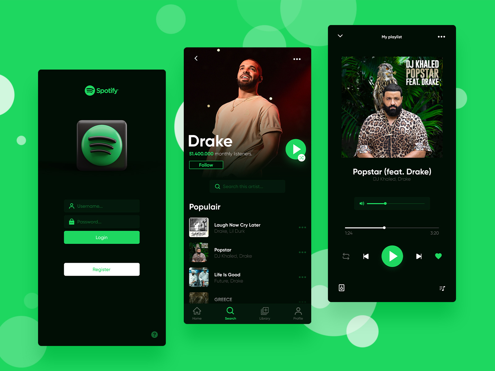
Spotify, the famous music streaming app, was criticized due to its complex mobile app design. Users were not showing much enthusiasm in using their app due to their complex navigation and lack of easiness in the app usage.
Then Spotify redesigned its mobile app and eliminated word-based buttons. They made the UI/UX design simple with easy-to-use buttons and smooth navigation to make it easier for users. After this new design implementation, the Spotify app got huge growth in user engagement and it got a hit in the market. A good UX design was the secret to their success.
Summing Up
While the battle between Figma and Adobe XD will continue, the conclusion point is that it doesn’t really matter which design tool you are using in your design projects. It solely depends on how much your design is focused on solving users’ problems. Then these tools will be more effective.
So merely having top design tools is not sufficient, you need intelligence and the right knowledge to create a really effective UX design that provides a high-quality user experience to the audience and makes your mobile app successful in the market.
MobileCoderz is a premier mobile app development company that has professional UI/UX designers who hold wide expertise in using trending design tools including Figma, AdobeXD, InVision Studio, and more. We have delivered some mobile apps which have helped our clients improve their business revenue through impressive user experience.
If you feel interested to improve your mobile app design and offer a nice user experience to your audience,
Book a Free Online Consultation and Discuss Your App Project With Our Experts
-

 Mobilecoderz Awarded as India’s Best iPhone App Development Company by Clutch
 -

 How Much Does It Cost to Develop a SaaS Application?
 -

 Mobilecoderz recognized as the Top App Development Company in Saudi Arabia by GoodFirms


